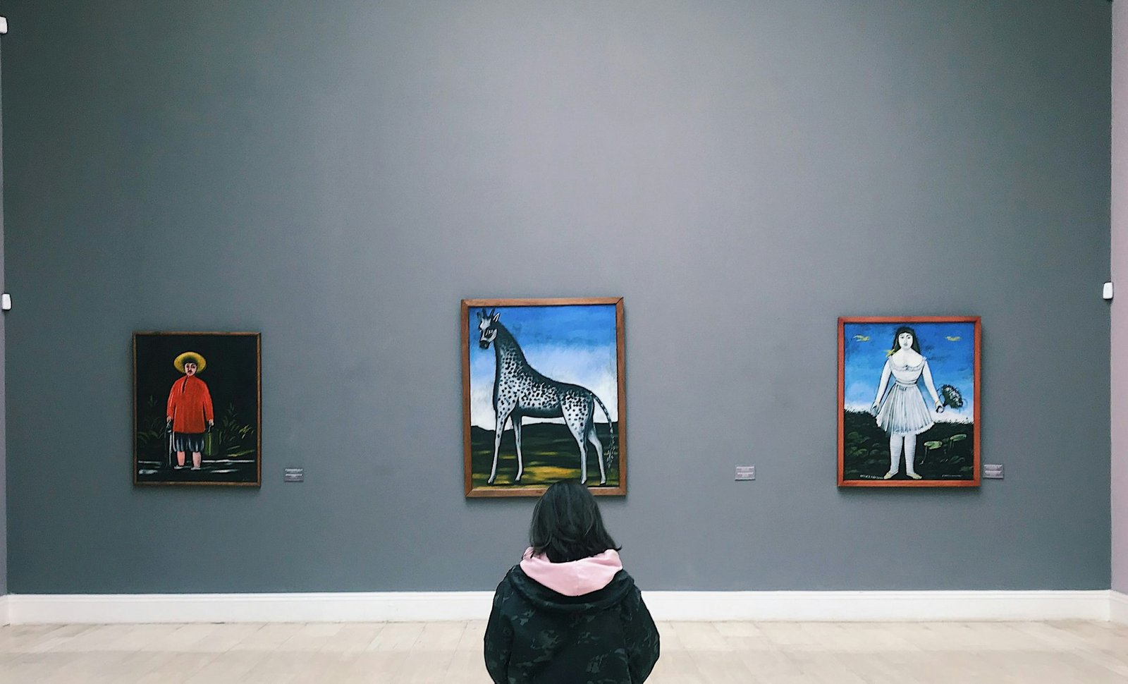
At this point in my career, I’ve designed so many reports and dashboards that I could probably do it in my sleep. When it comes to analyzing artwork, I use a similar approach while keeping rule breaking in mind.
Painting and data analysis both involve processes, which essentially follow a set of rules. In data analysis, the process includes cleaning, relating, aggregating, visualizing, simplifying, explaining; Extract, transform, load (ETL) or some variation. Then begins the steps for finding patterns or trends and adding visualizations. This process is fairly rigid. Dealing with every piece of data is not exactly the same, but skipping steps could lead to inaccurate results or mislead viewers.
Normally, information and metrics follow a pattern of importance for natural reading – think UI/UX design too. Visuals are placed to guide the viewer through the information while staying simple and consistent. Of course, common design elements come into play here.
I personally consider placement, size, color, variation, spacing, order, and clarity every single time I design.
This experience ultimately makes it easier for me to evaluate movement in artwork – how artwork guides me as a viewer through the painting.
I’m generally able to judge the focus, notice proportions, and assess composition. Patterns in artwork stand out to me, as do simplified objects, major shapes, color distinctions, and areas of contrast. Then I look for areas where the typical process isn’t followed.
I’m usually impressed with paintings where I can clearly see these elements of the process being followed and then intentionally broken. As an analyst constantly following process, I admire how rule breaking in art reveals originality and individuality.


Leave a Reply
You must be logged in to post a comment.